Styling a single element
The Style tab: colours, text, border, radius, shadow, opacity.
Everything about the selected component’s appearance lives in the Style tab on the right: background and text colour, font, size and weight, alignment, line height and letter spacing, letter case (UPPERCASE, lowercase, Title Case), slant and underline, border — width, colour and which sides show — corner radius (each corner separately if needed), shadow, opacity and blur.
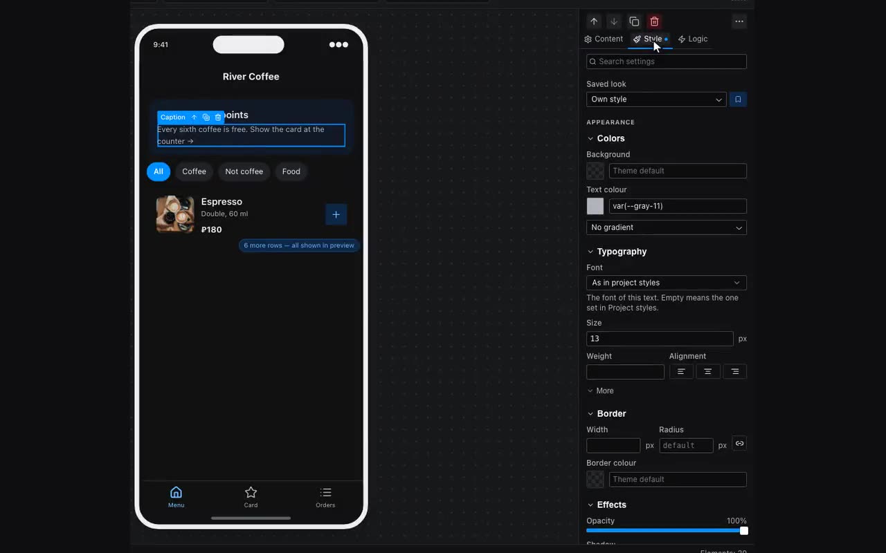
- The font in Typography applies to this text only — an empty field means “as in Project styles”. That is how a header logotype gets its own typeface while the rest of the text stays as it was. On a container, a section or a card the font is inherited by everything inside.
- Letter case is styling, not editing: a string bound from a table shows in UPPERCASE while the table keeps it as it was.
- Border sides — four toggles under the border colour (top, right, bottom, left); they appear as soon as the border has a width. That is how a separator under a list row is made: width 1, then switch off top, right and left — only the bottom line stays.
- On a button, a chip, a badge and an icon button the border is drawn around the element itself, not around the block: the colour and width here repaint the very outline that the “Outline” variant gives. Set a button to “Outline” and pick a border colour right here — the line becomes yours while the width stays as it was until you change it.
- Opacity comes in two kinds, and they are constantly mixed up. The “Opacity” slider under Effects fades the block together with its contents: set 35 % on a container and the buttons inside go pale too, as if they had slipped underneath it. When you want a translucent surface with sharp text on top, the opacity belongs to the colour itself: open Background and you will find a “Colour opacity” slider under the palette. Frosted glass is that plus “Backdrop blur” (Effects → More).
- “What goes on top” lives in Layout, under “Layers and scrolling”, behind the “More” lid. Higher sits on top; you need it when blocks overlap through a negative margin. Content is always drawn above its own block anyway, and a nested container above the outer one: the field is only for siblings, and siblings inside the same block are what gets compared. So “lift content above another block” means lifting that block, and “below a sibling” is set through layer order — the ↑ and ↓ arrows above the property tabs — not through a negative number.
- “On top of its siblings” sits in the same “Layers and scrolling”, behind the same “More” lid. The block steps out of the row: its siblings close up as if it were gone, and it lies over them right where it stood. This is the answer to “I pulled a button up with a negative margin and the block next to it came along”: once out of the row, margins move that block alone. Layout still picks where it stands — no corner coordinates to type; which of two such blocks is on top is the “What goes on top” field next to it.
- An empty Radius field is not zero. While it is empty the block is rounded the way the widget itself intends — an alert, an input, a card and a button each have their own default, which is why the field reads “default”. For a square corner type
0; clearing the field brings the default back. - Blur in Effects, behind the “More” lid, is two different sliders. “Blur” blurs the block itself, text and all — that is a backdrop. “Backdrop blur” keeps the content sharp and blurs whatever is behind the block: a translucent header over a poster. The second one needs a semi-transparent background — with a solid fill there is nothing to see through.
- Filter chips carry their own blur, separate from the bar. The backdrop blur under Effects belongs to the block — that is, to the surface beneath the pills — while the pills sit on top of it and get none of it. So the bar’s properties, under “How the chips look”, carry “Chip backdrop blur” next to the padding and the corner radius. A transparent bar with blurred pills is exactly the look Telegram’s own bars have.
- The pill answers the finger in the same section, “How the chips look”. “Chip colour while pressed”, “Chip text while pressed” and “Chip border while pressed” are what shows while the finger is on the pill, and “Chip press response” adds a slight shrink on top of the colour. By default there is no shrink and the colours are empty: the bar looks exactly as it looked. Fill them in where the list below the bar does not redraw instantly — otherwise nothing answers the tap.
- On a pinned block a translucent fill means “content travels underneath”. Such a bar sits above the scroll — otherwise there would be nothing to show through it: in the normal flow a block has only the app’s solid background behind it. Backdrop blur is not required for this; the transparency alone is enough. Neighbouring pinned blocks keep their own background: only the one you asked shows through. Inside the top bar the order runs downwards — the first block sits above the ones after it, so its shadow falls on them rather than the other way round.
- With nothing selected, the Style tab shows the screen itself: its background, padding and font. Clicking empty canvas clears the selection, so you may land there by accident — that is not a fault.
- Right-click → Copy style and Paste style move the look from one element to another without touching content.
- When a component has many settings, the panel has a search at the top (⌘⇧F) — type “shadow”, “padding”, “radius”.
- “Reset to default style” rolls the look back without touching text or logic.
- On a header, Size and Weight change the title, and Text colour also paints the icons — the back arrow and the right-hand button. Leave the colour empty and the icons keep their usual colours.
- At the top of the tab there is Style: a look can be saved under a name and given to other components, so they all change at once. The sliders button next to it lists every style in the project — how many components use it, and how to delete it. Deleting removes the style and leaves the look with the components, as their own.
A fill can also be a gradient: in the Look tab, under the background colour — “Gradient”, linear or radial, two colours and a direction in degrees (180° is top to bottom, 90° left to right). Each colour is an ordinary colour field, so it takes a light/dark pair and a binding. The gradient sits on top of the fill and under the background image: translucent black over a photo is exactly how a caption is made readable.
A background image can go on a Container, a Section or a Card — in the Content tab. Either an uploaded file or a binding: {{item.image}} inside a list gives every card its own cover rather than one for all. Next to it are “How the background fits” (crop or fit whole) and “Keep in frame”, exactly as on the Image block. An empty field means no background: a row without a cover will not show somebody else’s. A block with nothing inside gets 160 px of height from the background image itself — otherwise it stays zero high and the background is painted into nothing. Set a height yourself and yours wins.
Any colour field accepts a binding: {{userColor}} as a background is the colour the visitor picked, not the one you set. It is built like any other option choice: palette buttons remember a colour as userColor with the Remember action (store it in the visitors table and the choice outlives the session), and every other element is painted with the same {{userColor}}. For a light/dark pair the binding goes into each half separately: one name in memory holds one colour, not a pair.