Inputs and the form
A form binds fields into one submission. Every field has a name — that is the name the answer arrives under.
A Form is a wrapper: on its own it displays nothing. Put fields and a button inside and it binds them into a single submission, knowing what to send together.
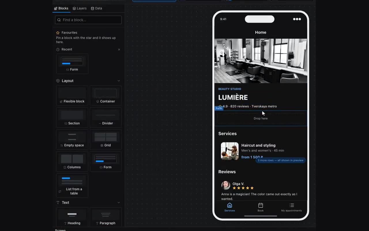
Fields: single line, multi-line, dropdown, checkbox, radio buttons, slider, toggle, date picker (date, date-and-time and time are separate). Each has a field name: that is the key the value arrives under. If there are many fields and no names, the form properties offer to name them all automatically.
Validation sits in the same place: required, minimum and maximum length. A form will not submit while a required field is empty.
A choice has two looks. Radio buttons line up “one per row” or “in a row” — the “How options line up” property; two answers like “Free / Paid” do not need a second line. A dropdown with “Allow several” shows its options as chips or as a dropdown field — the “How options show” property; “Max choices” sits next to it for when picking everything is not allowed. Both use the same field: since 28 Aug 2026 a single choice is drawn by the same control as a multiple one — it opens a list below itself, circles instead of squares, and closes as soon as you pick. Before that the single dropdown was the browser’s own control, with its own font and its own menu on every platform, and next to its neighbour it read as a field from another app.
The Theme switch lives here too but writes nothing into a submission: it flips light and dark. Two looks — an icon button for a header and a sun/moon toggle for a settings screen; the visitor’s choice is remembered and survives a reload, and the “Theme on open” property can change that to “Same as the messenger”, so every open starts from the client’s theme. The “Switch the app theme” action does the same from an ordinary button or a menu item. With no caption it is square, so a 999 radius makes it a circle — like the icon button in a header; with a caption the text sets the width.