Form fields that work well on a phone
The right keyboard and autofill, a phone mask, a hint under the field and checks — phone, pattern, length, repeat.
Where: The Text input block → the Content tab → What is typed. Checks are in the Checks group in the same tab.
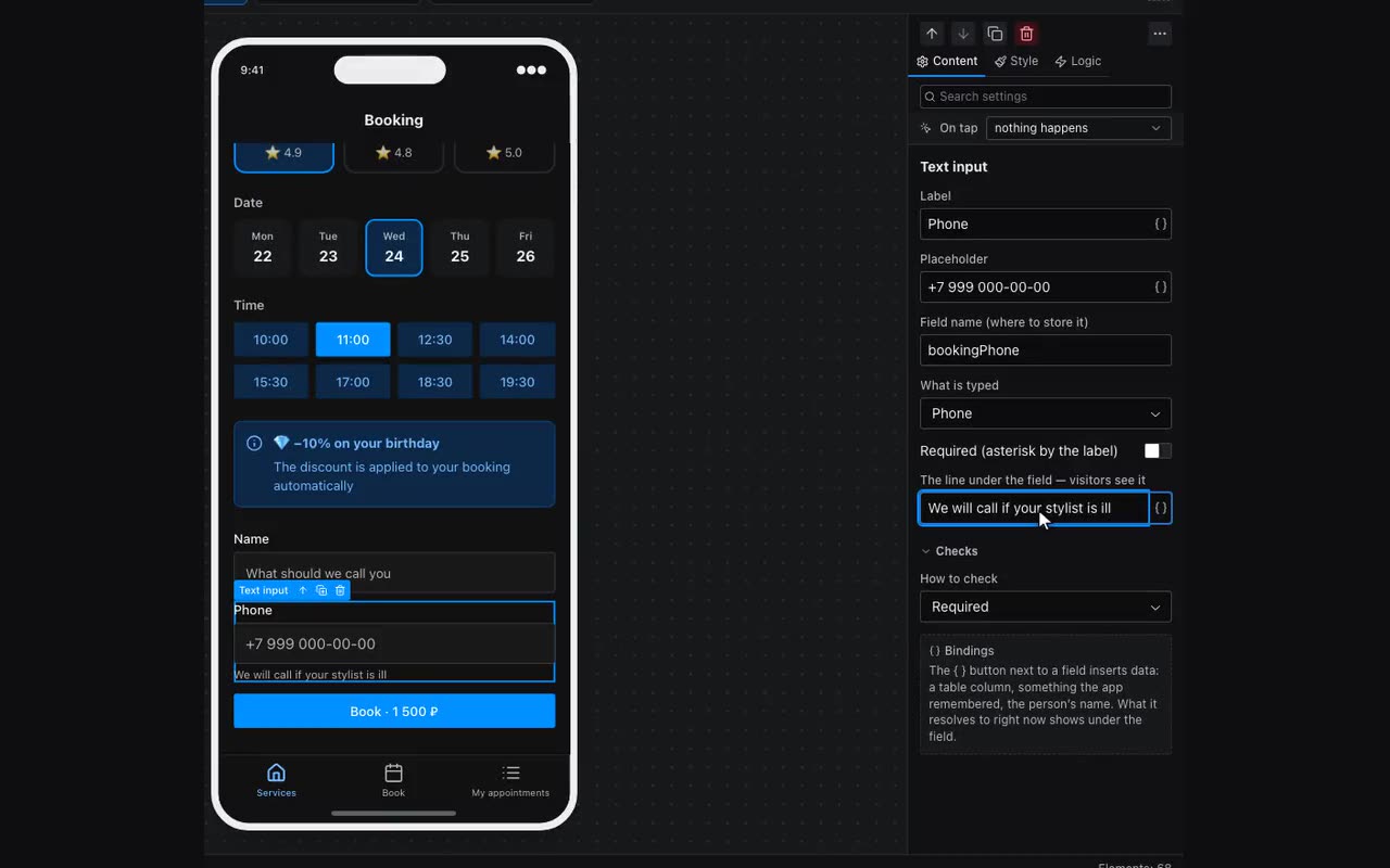
Forms are filled in on phones, and a field that opens the wrong keyboard costs extra taps at every step. What is typed tells the phone what to expect: Text, Name, Phone, Email, Number, Website. Phone opens digits, Email a keyboard with “@”, Name capitalises each word and offers autofill; Number opens a digit keyboard and accepts a decimal comma. A field with a kind uses 16 px text, so an iPhone does not zoom in when the cursor lands there. “Not set (as before)” is the old field.
Phone comes with a mask +7 (___) ___-__-__. The field turns a leading 8 or a number without a code into +7, and the submission and memory get +79001234567 — the same shape the “Ask for the phone number” action produces, so conditions and tables treat them as one. A number typed with another country’s plus sign is left alone. A half-typed number will not be sent.
The line under the field — visitors see it is a hint below the field: “We will call if your stylist is ill”, “As in your passport”. Required (asterisk by the label) puts an asterisk next to the field’s label.
Checks → How to check. On top of Required, Email, Minimum length and Maximum length there are now Length between (both limits at once), Phone number, Own pattern and Same as another field. Own pattern is a regular expression for the whole value: \d{6} is a six-digit postcode; next to it is “What to say when it does not fit”. A broken pattern never blocks the form. Same as another field is for repeating an email: pick the field to compare with. The length fields only show when a length check is chosen.