Text, images, icons
Heading, paragraph, caption, badge; images with aspect ratio and cropping; avatar, carousel, audio, video, QR.
Text components: Heading (six levels), Paragraph, Caption, Badge and Chip. Edit the text right on the canvas with a double-click, or on a phone with a second tap on the selected label.
A paragraph and a caption differ in role, not in machinery: a paragraph is body text, larger and darker, and its property is a multi-line box where line breaks are typed directly (on the canvas, Enter inside a paragraph does the same). A caption is the small muted line under something: a date, a unit, a note. So a three-line description is one Paragraph with line breaks, not three Captions in a row. Size, weight and colour of both are set in the Style tab, so they can be made to look identical if you want.
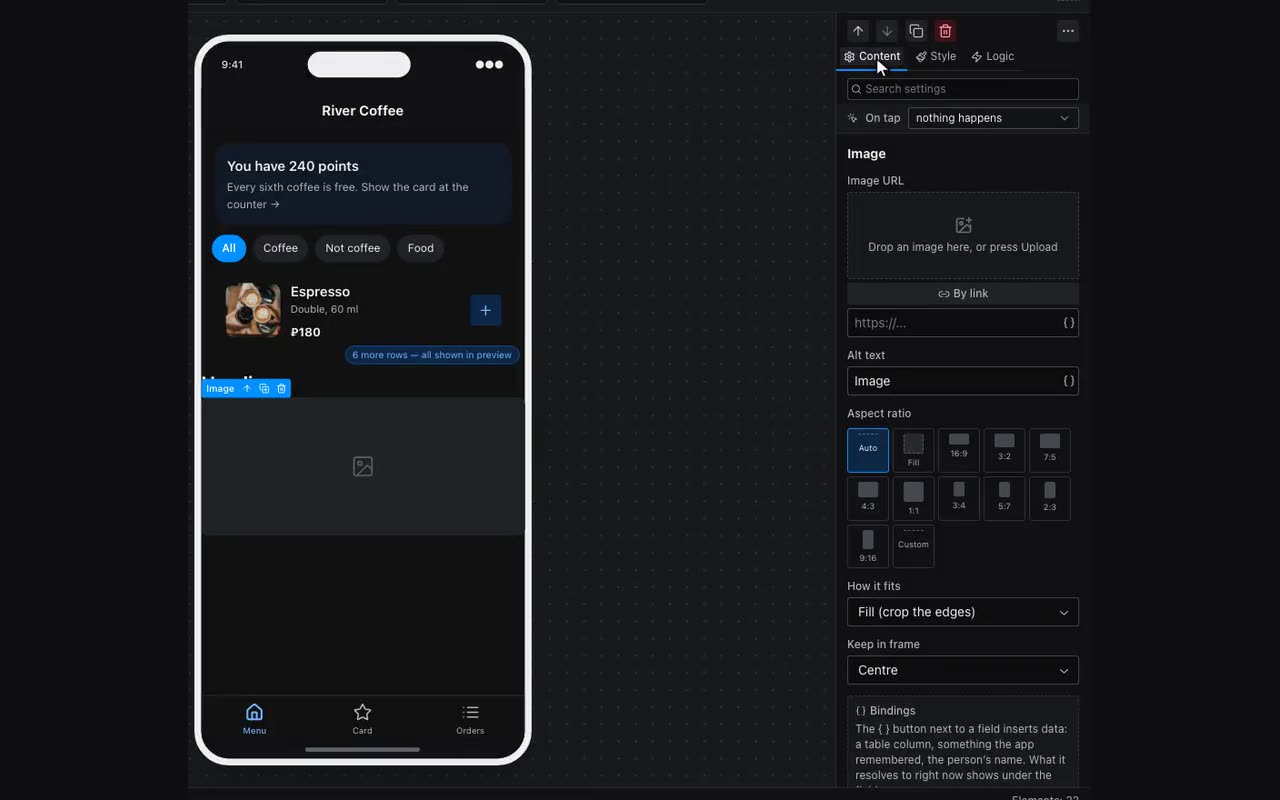
Image comes from an upload or a link. Aspect ratio is its own property (including a custom one such as 7:5), and the focus setting decides which part of the picture survives cropping. Fill in the alt text — it is the only thing a screen-reader user gets.
Aspect ratio has one more option — Fill: the image has no shape of its own, its height comes from whatever it stands next to. That is how a listing card is built — poster on the left, description on the right: the poster becomes exactly as tall as the description and crops, instead of leaving a gap under itself. Containers around the image stretch along with it on their own — wrap the poster in a 40%-wide block of its own and there is nothing else to set. When there is no height around at all (the image stands alone), the block stays 160px tall rather than collapsing to nothing.
- Avatar — a round image or initials. Often bound to
{{user.photo}}, with{{user.name}}in the initials field. The photo arrives in the launch parameters, and not every client puts it there: the same app, for the same person, showed the photo in Telegram on a computer and initials on a phone. So the app has a second route — it asks the owner’s bot for the picture, and it appears where the messenger did not send it. It will not appear if the person hides their photo in their privacy settings or never set one: initials are drawn then, and that is their decision, not a fault. - Carousel — a strip of slides swiped sideways. Addresses are listed in one field, comma separated, and a single line may mix pictures with video: a link to an mp4 or to a VK Video, Rutube, Dzen or YouTube page gets a player, everything else is drawn as an image. An address can be a substitution (
{{item.photo}}), so the strip can be built from a table column. Aspect ratio is the same as an image’s, down to a custom7:5. “Slide width” in percent says how much is visible at once: 80% leaves the edge of the next slide showing, 100% gives a full-width cover, and then the dots under the strip are what tell there is more. - Audio — a player with cover art, title and artist.
- Video — a direct file link (mp4, webm) or a page address from VK Video, Rutube, Dzen or YouTube: paste it from the address bar as is. A file gets our player, with muted autoplay, a poster and a speed button: tapping “1×” in the bar steps through 1.25×, 1.5×, 1.75× and 2×, and the chosen speed carries over to the next lesson. A hosting link opens the host’s own player, so its controls, speed and fullscreen button are theirs too.
- QR code — drawn inside the app from whatever you put in it: a booking number, a link, a loyalty code. The value can be a substitution.
- Icon — from the built-in set; you can upload your own as well (SVG or PNG, a whole pack at once).
Your own icon and colour. An uploaded icon is drawn as a picture by default — exactly as it was made, and the Color property does not touch it. Turn on Paint with the Color property underneath it and only the shape is kept, the colour comes from the property: the same icon turns white in the header, grey in an inactive tab and accented in the active one. The file’s own colour then stops mattering — what matters is the transparency around the drawing, so a white icon is fine to upload. Leave the switch off for multicolour icons — an emoji pack, a logo: those cannot be painted in one colour.