Fonts, weights and text styles
Weights from hairline to black, real italics and one size step for any text.
Where: The Style tab → Appearance → Typography. The steps themselves: More → Project styles → Typography.
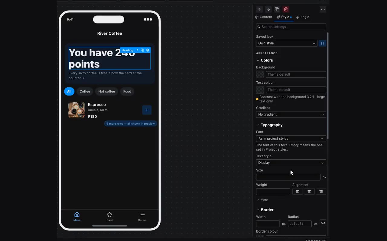
Text style is a step of the project’s type scale: Display, Title large, Title, Subtitle, Body, Caption and Footnote. Pick a step and the text takes its size, weight and line height. Change the step in Project styles and every text that uses it changes with it. That is how a price in a card gets exactly the size of a section heading, with no guessing in pixels.
The field is not only on headings and paragraphs: captions, badges, tags, buttons, list items, accordions, countdowns, stats, message bars, the Telegram main button, prices, record counters, headers and flexible blocks have it too. The four large steps use the heading font, the rest use the body font. A size, weight or line height typed below by hand beats the step; “Block’s own” brings back the old behaviour.
Display is the largest step: 40 px, weight 800, line 44. It is for the first screen of a landing page, a stylist’s name on a business card, a figure on a banner. In Project styles → Typography it is the first row and is edited there like the rest.
Weights and italics. Fonts from the list arrive with every weight the family has, and with real italics where they are drawn. The font picker says so next to the name: “100–900 · italic”. The Weight field never goes past what the font can do — Manrope, for instance, runs 200–800 — and the italic button under Slant (behind More) only appears for a font with a real italic: a faked slant is drawn crooked by the browser. For your own uploaded font and for a CSS stack the whole scale is open — only you know what is in them.
Line wrapping lives in the same place, behind More. “Even lines — for headings” spreads the words so the lines come out close in length and a single word never hangs on the second line. “No lone last word — for paragraphs” keeps the last line from being one word. The field is on headings, paragraphs, captions and flexible blocks. New headings get even lines by themselves; the ones already placed stay as they were.