How the app looks on a computer
A separate layout for wide screens; what you built for the phone stays untouched.
Where: Toolbar → the Computer size. The mode: More → App settings → On a computer.
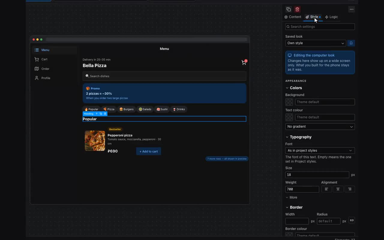
Apps are not opened from phones only: Telegram and MAX run on computers, where the window is three times wider. The On a computer setting decides what happens there. “A column in the middle” (the default) keeps the app at phone width, so it looks exactly as you built it. “Full window width” is the old behaviour — the phone layout stretched. “A layout of your own” is the third answer: the screen takes the whole window, and you say what fills that width.
Turn it on, then pick the Computer size in the toolbar — the app appears in a 1280 × 800 window. From there every field under Look and Layout is edited for the wide screen only: a bigger heading, a column count for lists, a maximum width for the screen so a line of text does not run across the monitor. The phone value stays as it was: switch the size back to iPhone and nothing has moved.
The shell rearranges itself on a wide screen: the bottom menu becomes a column on the left with labels in full, and a bottom sheet turns into a centred window. Nothing to set up — a bottom bar is made for a thumb, and a monitor has none.
What to show on computers only — or on phones only — is a display condition. The list of placeholders holds “Wide screen (computer)”, written with the ready-made “is filled” operator, just like “Opened in Telegram” next to it.