Choosing an option: highlight the tap
A tap remembers the choice, and what is remembered highlights what was chosen — a master, a date, a time, a seat category.
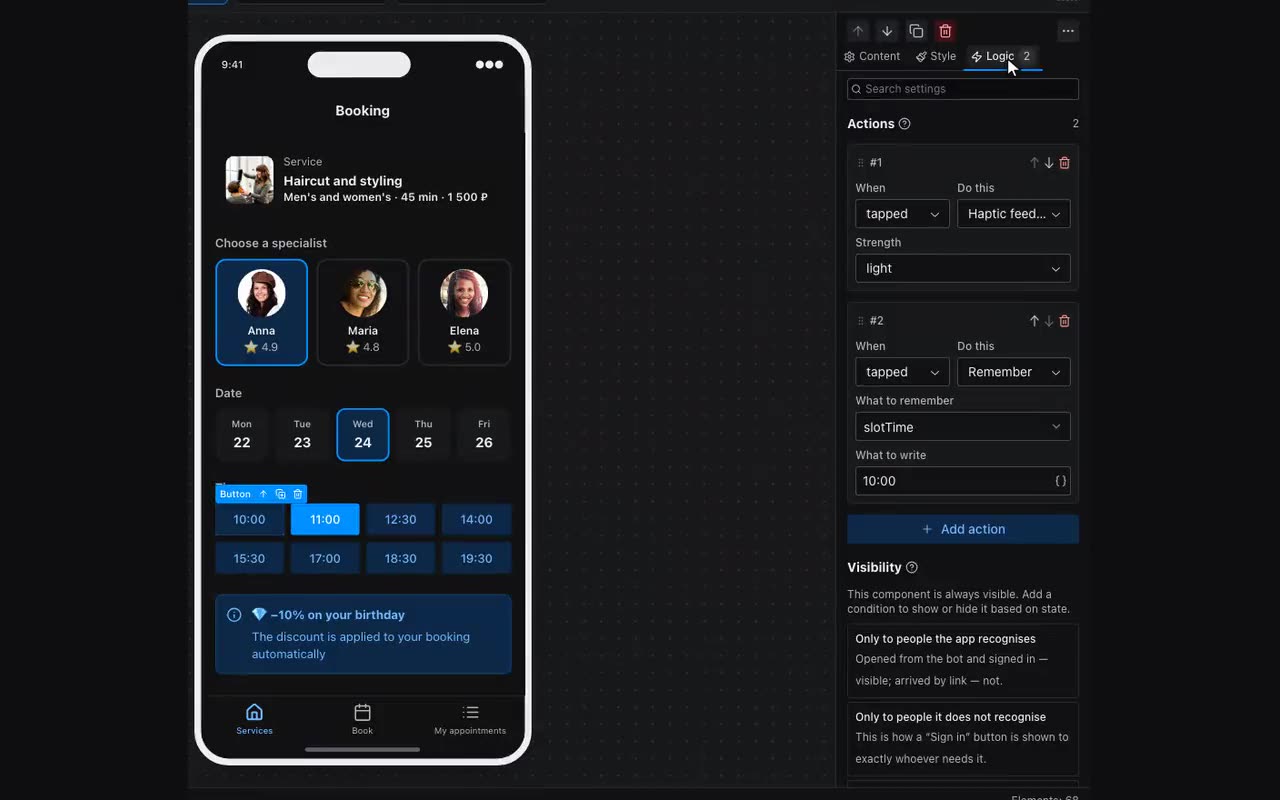
A choice between options is built from two halves, and you need both. The first is the Remember action: a tap remembers this option’s answer. The second is the highlight: buttons and cards have a pair of properties, Highlight when and equals value. The first takes what is remembered ({{slotTime}}), the second takes this option’s own answer (11:00). When they match, the option lights up.
- Add a name to memory —
slotTime, say — under Data → “App memory”. - On each option button: the Remember action,
slotTimein “What to remember”, and this button’s own time as the value. - In the same properties: Highlight when =
{{slotTime}}, equals value = the same time. - The choice is worth carrying on: put
{{slotTime}}in a caption, in the request to the owner (“Add to the request”), or in a list row.
A card gets an accent border and fill over its own styling; a button turns solid while the rest go soft. The filter chips strip does the same thing in one block — that one is for narrowing a list, this pair is for everything else: master photos, date tiles, seat-category rows.
A button’s highlight colour lives in the same properties: Background when highlighted and Text when highlighted, next to Background while pressed, Text while pressed and Border while pressed — what shows while a finger is on the button. The border appears even on a button that had none, as a one-pixel line; on a button with its own border the pressed colour simply repaints it and the width stays as it was. Leaving any of them empty means “follow the theme”, and the button looks exactly as it did. As everywhere, each colour can be given as a light/dark pair. Next to them sits Press response: by default the button shrinks a little under a finger, and “Colour only” removes that — on a button as wide as the card, a fill pulling away from the edges reads as the layout twitching rather than as a response.
Below the press response sits After release. By default the press lifts with the finger — the pressed colour shows for an instant. Stay pressed keeps it until the same button is pressed again: that is how “Sign up”, “Like” or “I’m coming” are built — the button remembers it was pressed. It remembers that to itself as long as Highlight when and equals value are empty. Fill that pair in and the app memory does the remembering: the button is pressed while what is remembered equals its value, and pressing a neighbour changes it so this one releases itself. That is exactly how option buttons behave on the web, and exactly what a memory inside the button cannot give: neighbours know nothing of each other. Such a button has no highlight at all — no separate colours (the panel stops offering them) and no swap to the solid variant: the chosen one is painted with “Background while pressed”, so there is one colour on the button rather than two stacked. Shrinking stays a response to the finger: a button left pressed keeps the colour but springs back to size — one that stays squeezed forever reads as broken layout.
The same state colours and the same press response are now on the chip and the icon button — neither had them before, so there was no way to highlight a selected chip in your own colour. On a chip the press response defaults to “Colour only”: it never shrank, and we did not turn that on for everyone at once.
Popup — your own blocks over the screen. It sits on the screen as an ordinary block (labelled “Popup” on the canvas) and takes anything inside: a list of links, a theme switch, a form. The visitor never sees it until something shows it with Show a popup panel — any button, row or picture will do. How it appears decides what it is: a sheet from the bottom, a window, or a panel from the edge taking a set share of the screen — which is how a burger menu and a tap-the-avatar menu are both built. A window is placed by Where horizontally and Where vertically: it sits in the middle by default, and “right” plus “top” turns it into a menu dropping out of a header button. It closes on a tap outside, on Back, and with Close the popup panel; moving to another screen closes it by itself.
Show on screens decides where the popup exists at all. By default only on its own: a popup lives in the tree of the screen it is built on, so Show a popup panel from another screen would have nothing to open. “On every screen” and “On the ones picked below” lift that: build the menu once, on one screen, and open it from anywhere — including a button in the pinned header. Pinning the popup itself into the app shell is no longer the way: there it took up space in the bar and showed in the layout, when what should show it is an action.
Drawer menu, its name notwithstanding, is not a sliding panel but a list of rows with arrows: each with its own icon, its own screen and its own visibility condition. It sits where you put it, as an ordinary block — on a profile screen it is a ready-made list of sections. It becomes a drawer inside a Popup set to “a panel from the left”: the list inside, a burger button outside with Show a popup panel on it — that is a burger menu, whole.
How it differs from the Show a popup action: that one is the messenger’s own dialog — a title, a message and buttons, with nothing of yours inside. A Popup is drawn by the app, so it holds ordinary blocks with all their properties and actions.
The icon button has a Caption under the icon — a word below the glyph, substitutions included. Leave it empty and the block stays the square button it always was; fill it in and the block grows to fit, the icon sits above the word, and both take the button’s colour, highlight included. Space to the caption appears next to it — the gap between glyph and word; size, weight and line height the caption takes from Typography on the Style tab, like any other text. That is how a custom bottom bar is built: a row of these in a container pinned to the bottom, each with its own width, its own action and its own visibility conditions — which the ready-made Bottom navigation, with one shared list of items, does not give you.
Variant and colour are now asked the same way on the button, the icon button, the badge and the chip: Variant — solid, soft, outline, ghost; Colour — project accent, gray, green, red, amber. Before that only the button had a variant (and only on the accent), and only the badge had a colour (and only as a soft fill), so a red button or an outlined badge simply did not exist: you had to build them from the Style tab’s background and match the text and border colours by hand. The chip has a fifth variant on top of the four — “Theme default”, the grey pill it has always been; its colour is asked as soon as any other variant is picked.