How the editor is laid out
Four areas: the screen strip, the left panel, the canvas and the properties on the right.
- The screen strip — every screen of the app. Add, rename, duplicate and set the start screen here. The + on the right asks which screen to add — blank or from a template; the + on the left adds a header or a tab bar.
- The left panel — three tabs. Components is what you can place, Layers is the tree of what is already there, Data holds tables and the app memory.
- The canvas in the middle is the screen itself. Drag components in, double-click text to edit it, right-click for the menu: duplicate, wrap, convert to another component.
- Properties on the right — everything about the selected component, in three tabs: Content (what it says), Style (how it looks), Logic (what it does on tap and when it shows).
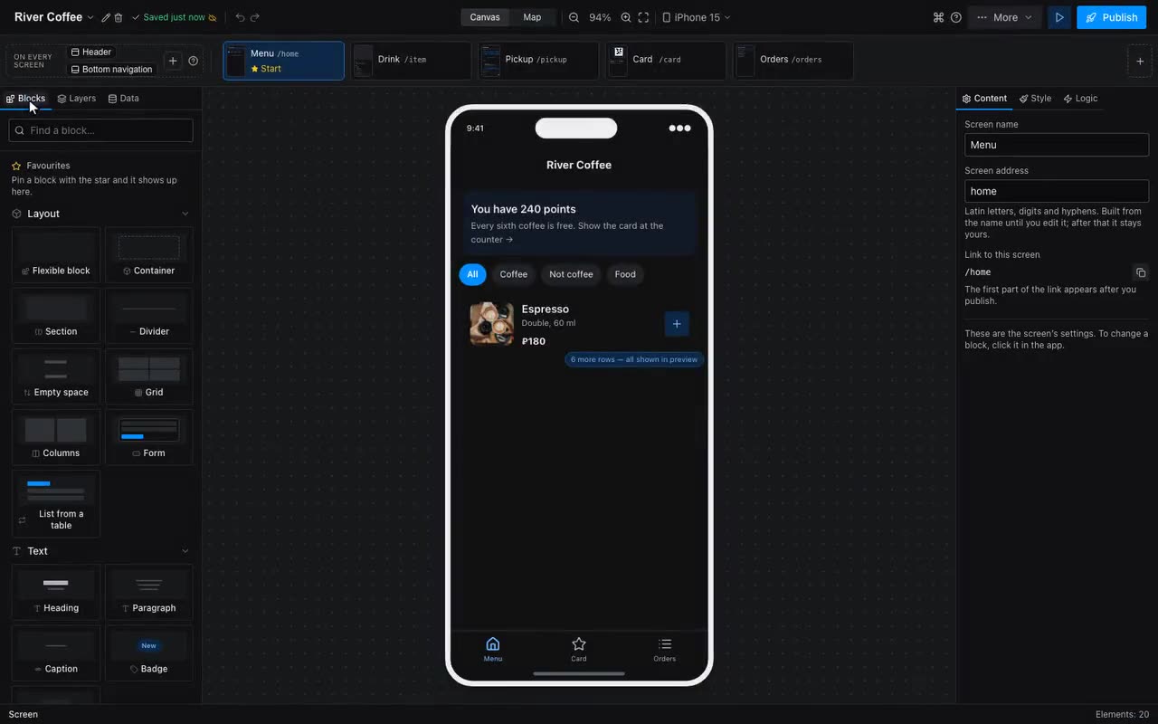
Two things at the top are easy to miss: the Canvas / Map switch — the map shows screens and the arrows between them — and the More menu, which holds templates, project styles, payments, submissions, statistics, the QR code and this handbook.
The size you are looking at is picked at the top right: iPhone SE, iPhone 15, Android, and tablets — iPad mini and iPad. A tablet here is not about the diagonal: from 700 points wide the app lays out differently — as a phone-width column in the middle, if that is what the “On a computer” setting in the project styles says. The canvas and the preview show exactly that.
Both side panels can be dragged: move the cursor to the edge between a panel and the canvas — it turns into a double arrow — and pull. Long column names under Data and a deep tree under Layers then fit. Double-click the same edge to restore the default width; the width is remembered per browser and never travels into the project.
Where: Lost? Press ⌘K (Ctrl+K). The command palette searches the whole editor: components, templates, actions.