Layout: containers, grid, spacing
Container and section to group, grid and columns for rows, spacing for air.
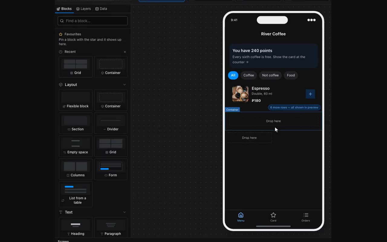
- Container — a box you put things into. It has direction (column or row), distribution, gap between children, padding, background, border, corner radius.
- Section — the same container, pre-set for a meaningful chunk of a screen.
- Card — the same container with a ready look: surface fill, rounded corners, a hairline border and a soft shadow. Plus two properties, “Highlight when” and “equals”: when they match, the card takes an accent border and fill, which is how a pick-one-of-several is built (a stylist, a date, a seating tier). Everything else about the two is identical — a container can be dressed up into a card by hand; the card only saves you the trouble.
- Grid — tiles in several columns: a catalog, the sections on a home screen. Column count and gap are properties.
- Columns — two or three blocks side by side in one row.
- Divider and Spacer — a line and empty space. Prefer a spacer to an empty paragraph: an empty paragraph is something you later hunt for in the layers.
Spacing lives in the Style tab → Layout: padding (between the border and the content) and margin (between this block and its neighbours). Sides are set individually.
Any container lays out as tiles, a repeater included. Style → Layout → “Place blocks” — four answers in one row: “One under another”, “In a row”, “In a row, wrapping” and “As tiles”. Tiles land in as many columns as you set below, up to six, all equal in width; the space between them is the Gap field. This is exactly what a repeater wants: posters land two to a row, while “Show more” and the empty-list message span the full width rather than one cell. The ready-made Grid and Columns blocks do not offer the choice — they lay themselves out from their own properties in the Content tab.
Alignment is cleared by the same click that set it. The 3×3 grid in the Layout tab sets both axes at once; click the selected cell again and both are cleared, leaving the block laid out the default way. To clear just one axis, use Distribute — its list starts with “Default”.
“How this block sits” answers “the parent ruined the child”. Alignment set on a card shrinks the blocks inside it to the width of their content: “Space between” inside such a block has nothing left to spread, since it is already as wide as its text. Open that block, Style → Size → “More” → “How this block sits” → “Stretch”, and it goes back to full width without touching its neighbours. The same field gives it its own Center or End against the parent.
A strip that scrolls sideways is “Place blocks: In a row” plus “More” → “What to do with what does not fit: Scroll”. Cards in it do not shrink — there would be nothing left to scroll — and never grow wider than the strip itself. Give them a width: on the card, Size → Width, say 240, so the next one peeks in from the edge and the strip reads as scrollable. Without a width a card fills the strip, sized by its own content: an image inside brings its natural size along. This is how “Coming soon”, “New in” and “Categories” rails are built, and a repeater does the same: its direction is set in the same place.