List from a table: showing records
One card, any number of rows. Design it once, it renders them all.
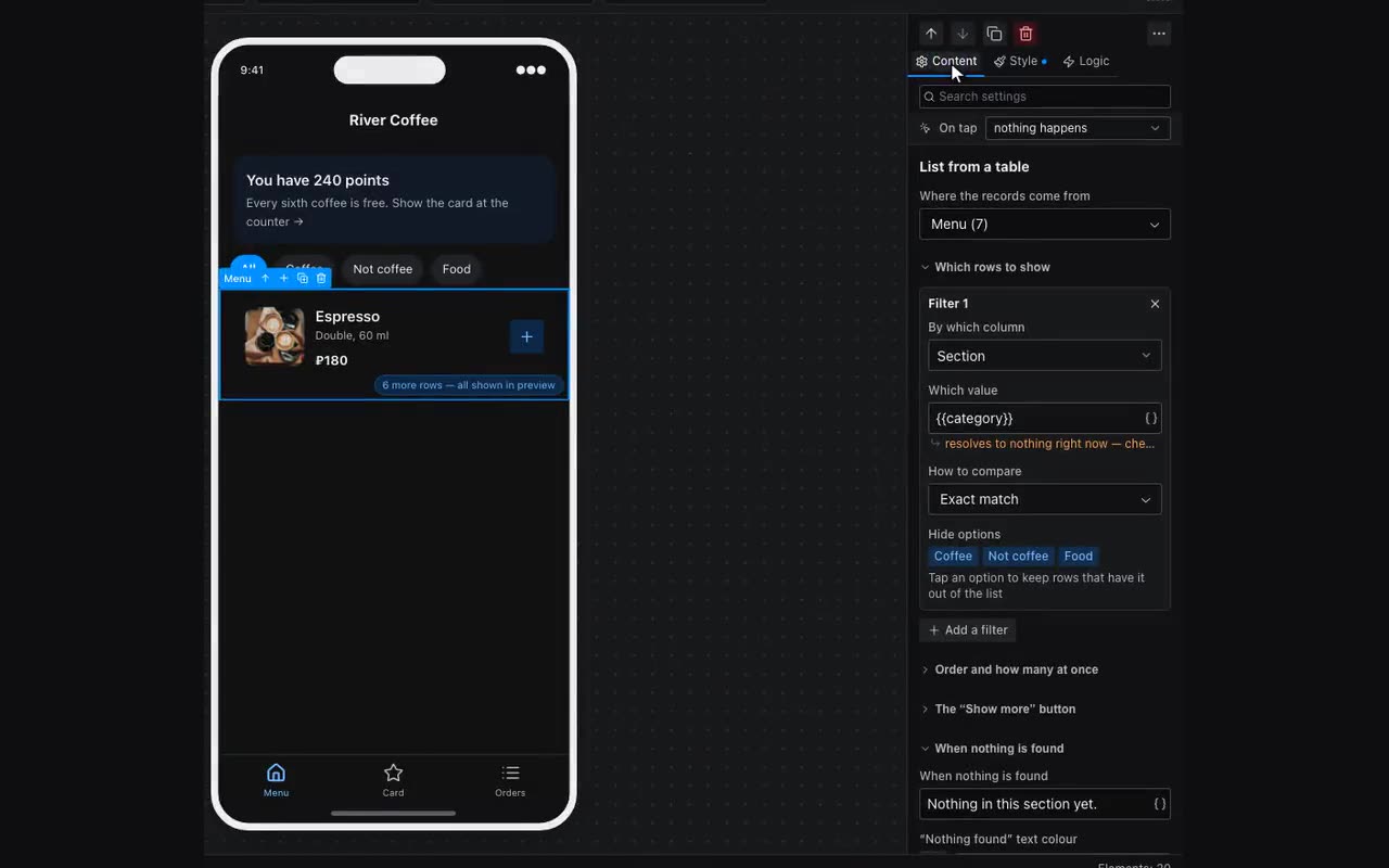
This is how catalogs, event listings, schedules and “my orders” are built. Drop a List from a table in, pick a table in its Data source property, and design one card inside. The rest draw themselves, one per row.
One list from two tables. In “Data source” pick “Custom JSON, or several tables” and join them with a plus: {{events}} + {{venueEvents}}. Rows are appended into one list and everything downstream is shared — filters, sorting, “show at most”: sorting by date interleaves rows from both tables. An external table (Yandex Tables, Google Sheets) works the same way: a partner keeps it on their own account, and in the app it is just another table. To make the cards look different, put two blocks in the repeater and give each the display condition “item.__table equals the table key”: {{item.__table}} on every row is the key of its table. For such a list the data picker groups each table’s columns separately, and filters and sorting offer the columns of both; a column missing from some tables is marked — filtering on it drops the other tables’ rows. So it is best to give the date the same key in both tables.
Inside the card, values come from {{item.…}} — the { } button next to a property inserts the right column. One setting applies to every card at once.
{{item.title}} · {{item.price}} ₽The repeater also filters: two filters (field, comparison, value), sorting with direction, a “show no more than” limit and a message for when nothing matches.
The limit can turn into pages: fill in the “Show more” button caption and ten cards out of fifty become the first ten, with the rest loading on tap. An empty caption just truncates the list as before. Changing the filter starts the count over.
The button itself is styled right there: variant (outline, solid, link), button and label colour, and since 28 Aug 2026 the press response too — pressed background, pressed label, pressed border and a “Shrink”/“Colour only” choice, exactly as on an ordinary button. Until the list redraws, nothing else confirms the tap. The colours accept bindings: {{userColor}} works here like in any other colour field.
Empty, loading or failed. While table rows are on their way from the server, an empty list shows “Loading…”; if the read fails, “Could not load” with a “Try again” button. When there really are no rows, the text from “When nothing is found” is shown. New lists come with it filled in; clear the field if you already have your own “cart is empty” block with a display condition.