Flexible block: one instead of eight
For when a ready-made block almost fits and one property is missing.
Ready-made blocks do not expose everything: a button has fill variants, a badge has five colours, a chip has its own. That was not by design — each property arrived when somebody asked for it. The Flexible block works the other way round: everything is open at once, and what it becomes is up to the Behavior property.
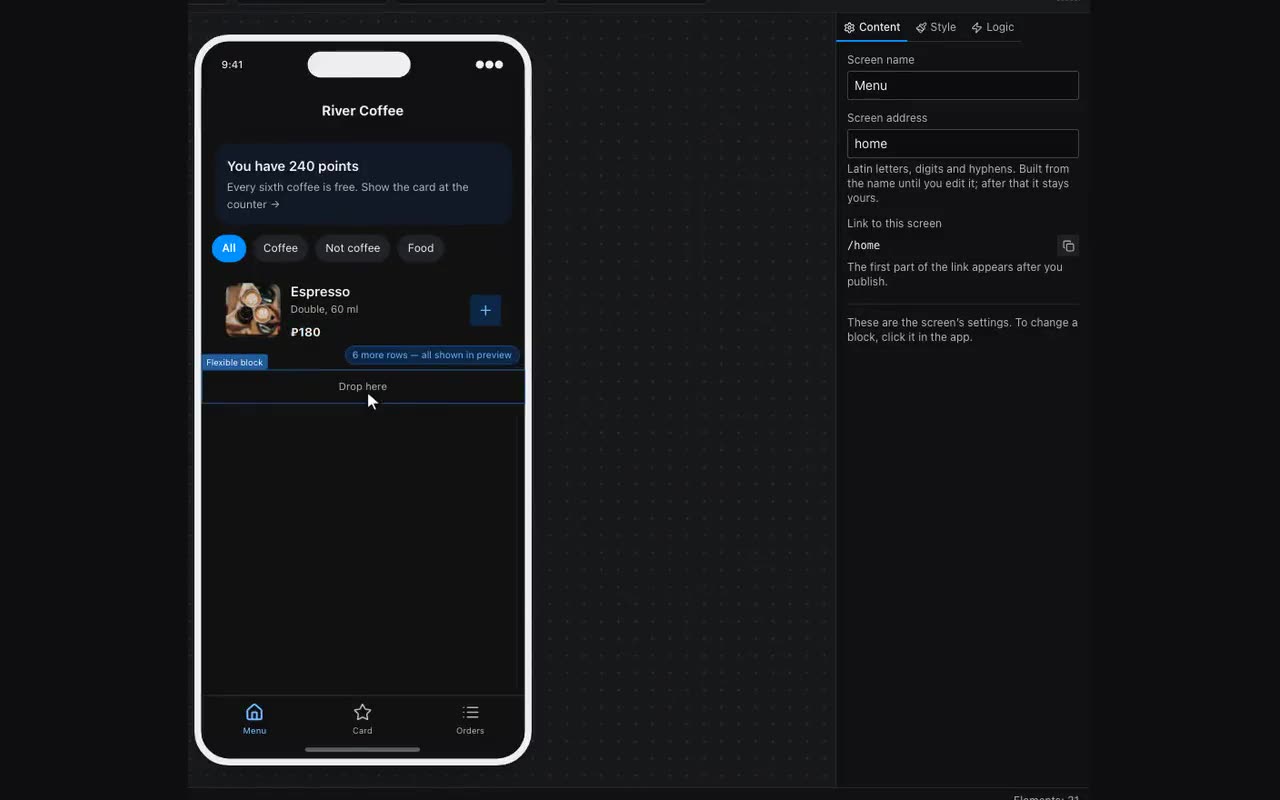
- Surface and Card — blocks you put other blocks inside. The only difference is the look: a card arrives with a fill, rounding and inner space.
- Text and Heading — own text without a fill, in different sizes and weights.
- Button and Link — pressable: you can attach an action, and they depress under a finger in the app.
- Badge and Chip — pills. The chip does what the normal one does: takes its colour from a table column’s option.
- An icon inside a button is a nested Icon block rather than a property: drop one into the primitive and it lands inside the same fill as the label. A row layout puts the icon to the left of the text, with the gap set right there. That is also how a custom tab bar is built: a row of such buttons in a container pinned to the bottom.
The panel shows only what applies to the chosen behavior: fill variants for a button, colours for a badge, pressed and highlighted colours for pressable ones. Everything else — fill, text colour, rounding, padding, font — comes from the Look tab like any block, and wins over how the behavior would draw itself.