The shell: header and bottom menu
Pinned to the shell, the header and the menu show on every screen and stay put during transitions.
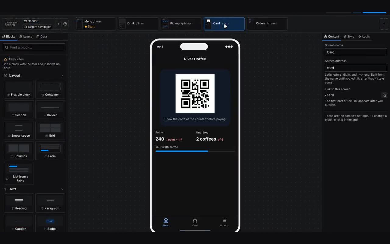
A header and a bottom navigation bar can live inside a screen — then they scroll with the content and exist only there. Or they can be pinned to the shell: shared by every screen and staying in place as screens change. The second is what people usually expect from a menu.
Where: Right-click the component → Pin. The same menu has “Hide on this screen” for screens where the bar is unwanted — a welcome screen, say.
What is pinned shows in the screen strip, in the On every screen frame to the left of the screens: top bars on the upper row, bottom bars on the lower one, the way they sit in the app. A click selects the block, a right-click hides it on the open screen or unpins it, and the + in the frame adds a new bar.
The easiest way in is the + button at the left end of the screen strip: it lists the kinds — Header, Header with a button, Bottom menu, Bottom menu without labels, and an Empty container for a band of your own, separately for the top and the bottom. A ready-made tab bar arrives already wired to the project’s first screens rather than as dead tabs.
It is not only the Header and the Bottom menu that can be pinned. Any block — a container with a logo and a button, a filter strip, a card with the order total — can become part of the shell; a top-level block has “Pin to top” and “Pin to bottom” in the “⋯” menu above the property tabs. A pinned block shows a pin in that row — tap it to unpin. That is how you build your own header when the ready-made one is not enough.
Pinning to the shell means “visible on every screen”. When a block should stay in view on its own screen only — a filter strip above a list, an order total above the cart — that is a different field: “Stays in view while scrolling” in the Layout tab, under Stacking. The block stays in view while the screen scrolls under it and leaves with the screen on a transition. Give it a background: a transparent one shows the content passing underneath.
“Top” and “Bottom” hold differently, and it shows. At the top the block sticks where it is: it stays in its own row and inside its own block — chips sitting in a container will not travel past that container, and they settle below the pinned bars by themselves. At the bottom the block moves to the bottom edge of the screen and stays there wherever it lives; it spans the full width there, so a background and some padding are a must.
Two such bars fit on one screen: they stack one below the other. The second stops right under the first, the third under the second, and nobody counts heights by hand — they are measured on the screen. Only bars above it on the screen add up: a group heading that sticks inside each card of a list does not build a stack and holds the edge on its own.
There is no limit on how many blocks are pinned, and they stack in order: the header, a filter strip under it, then whatever else. The ↑ and ↓ arrows above the property tabs set that order — the same two that reorder an ordinary block among its siblings. Unpinning returns the block to the current screen and deletes nothing.
What is inside a pinned block reorders in the layers list exactly as it does on a screen: every row inside a band has a grip on the left and can be dragged up, down, or into a neighbouring pinned block. The ↑ and ↓ arrows move the band itself; dragging moves what is inside it.
Menu items are configured in the properties: label, icon, target screen. An item can carry a count badge — put a substitution like {{cart.count}} there and the Cart item shows how many items are in it. An empty value or a zero draws no badge.
Items also take visibility conditions — “Show when”. That is how an admin section visible only to you is made: compare {{user.id}} with your own Telegram id.