Strips, bento grids and the computer layout
Cards that swipe sideways; tiles with uneven columns; a skeleton while loading, your own empty state and the bottom menu’s look.
Where: A container or a list from a table → Style → Layout → Layout → Place blocks.
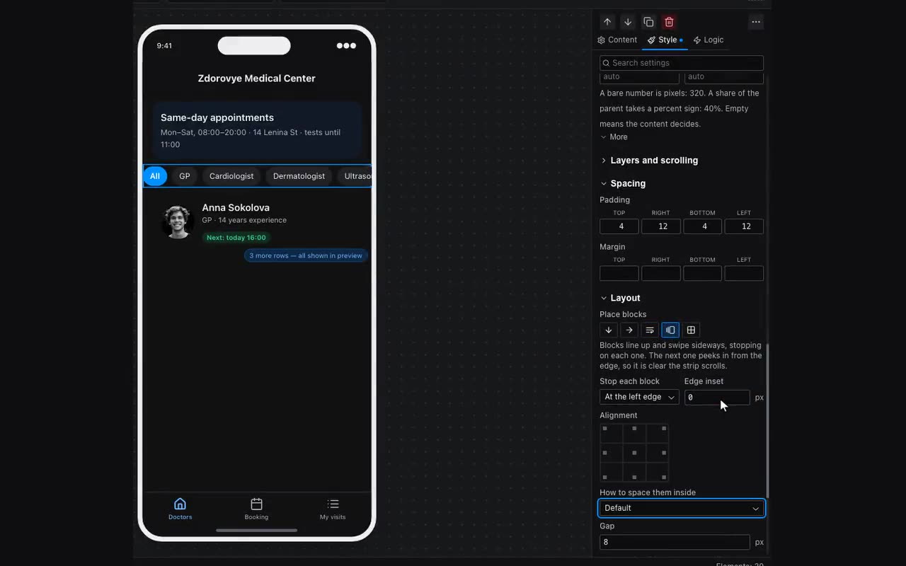
As a strip puts blocks in a row that scrolls sideways and stops on each block rather than halfway between them. “Stop each block” — At the left edge or In the centre. Edge inset (16 by default) moves the first card away from the edge and makes every card without its own width as wide as the strip minus the inset — so the next one peeks in from the right and it is plain the strip can be swiped. That is what cards need; for tags and pills set it to 0 and they keep their own width.
Tiles with uneven columns. As tiles now has Column widths: Equal, 2fr 1fr, 1fr 2fr, 1fr 1fr 2fr, 1fr 2fr 1fr or Custom… — fractions separated by spaces, points work too: 1fr 240px. As many fractions, as many columns.
Bento is a tile grid where one cell is bigger than its neighbours. Select a block inside the tiles: Style → Layout → Size → Cells it takes, Columns and Rows. A tile never grows wider than the grid itself. The field only appears on a block inside a container set to As tiles; the Grid block lays itself out through its own properties and does not have it.
Separately for a large monitor. With “A layout of your own” chosen in App settings, the Computer size shows a Tablet and computer / Computer only switch above the Style tab’s fields. The first is the old behaviour: the edit applies to every wide screen. The second edits windows from 1100 points only — four columns on a monitor, two on a tablet.
While the list loads and when it is empty. A list from a table has a “While loading and when empty” group in its Content tab. While loading → Card skeleton draws three shimmering placeholders shaped like your card instead of “Loading…” text — the screen does not jump when the rows arrive. Custom empty state → Build it puts a “When empty” block inside the list with a starter — a heading and a line of text; add a picture and a button. Visitors see it only when the list has nothing — instead of a “nothing found” line. A container already inside the list can become the empty state too: it has a “Show instead of an empty list” switch.
Bottom menu look. Bottom navigation has a “Menu look” group: Bar (as before), “Pill under the selected item” — the active item sits on a highlighted pill — and Floating panel, which hovers above the screen with a gap from the edges. Next to it is Label size, 10 by default.